Form Control Features
The Form acts like a parent template to other application pages, where its properties are both global and unique. Its global in that any graphical object placed on the form is visible to other pages, unless the area occupied by the object is obscured by another graphical object like a solid-colored page.)
For example, if you place the Layout control directly on the Form, and then add pages that towards the bottom of the form and you left the Layout control exposed, the objects inside the Layout control will be visible to all the pages.
The Form Heading property group contains the text that appears in the heading of a form/page and controls the appearance of the form header.
Whether the text displays depends on the Form, Heading, Visible values in the application.
For example,
a) If Visible =True and
b) If a value in the Heading TextId property is assigned, the Translation Text assigned to the Text Id from the Solution Explorer > Text Resources table will display in the Form Heading property field at design and runtime.
-
If the Form Heading: Visible = True, and the Form Heading's text field has a text string that was entered at design time and the Form Heading TextId value is blank, then the string in the Form Heading's field will be used at design and runtime.
-
If the Form: Heading: Visible = True, and the Form Heading's text field is blank, and the Form Heading's Text Id is blank, then the heading will remain blank at run time.
-
If the Form: Heading: Visible = False, then the heading is disabled on the form and all pages, even if the page had a heading assigned.
-
If you have multiple pages in the application, and you want each page to use the same heading that appears on the Form, leave the page's Heading and TextId blank. Otherwise, the values you enter at the page will supercede the value set at the Form property level.
The heading's look and feel are derived from the theme if set to "(Default)" or "Control Default". If you set the property, the value will take precedence over one from Themes, and the value will often appear in black text. For values that are inherited these are represented in colored text. For example, if the margins are number-based, and are set in Themes, it may appear as colored text. For example "Margins: 2,2,2,2." To add icons to the heading see the SystemIcons property.
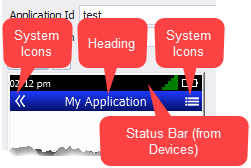
Note: The height of the black status bar is visible in the form's Display: Target: StatusBar properties. The status bar value is sourced from the Solution Explorer > Devices > [device skin name ] property.
The form inherits its look/feel from the Solution Explorer > Themes: [name of the theme]: Application settings. The values from themes are used if the child object on the form is exposed. (i.e. If you set a logo in the upper left corner of the form and its not obscured by a page control, then the logo set in the theme will display. For more details, see the Themes Overview topic.
One of the most important features is the Display property where its used to set which device display is used to host your graphical objects. If desired, you can set your displays so that the placement of objects is dynamic or static. For example, if you want RFgen to automate layouts, this means if the the display resolution, size and orientation changes, RFgen will the presentation of the objects relative to the edges of the nested and parent objects and display space. BUT if you want your display to be static, you can setup you displays to be exactly the same as well.
Displays and Locales
You can choose to have an application use multiple types of device displays, and associate a specific locales like Chinese, German, French etc. for each display so an application can be deployed to different devices and locales. (See Solution Explorer - Devices topic or the Form Properties: Display property for more details.) Having multiple display types within an app can make it easier to code apps for companies who use a variety of different apps for the same task.
The screen’s sizing, automatic translation, number of displays (display types), and look and feel are only controlled by the properties in the form. The form’s heading, display of the menu icon= and\or back button < and the menu’s appearance and interactive behaviors are controlled in Mobile Themes and by the properties in the Form.
For a description of the properties used on the Form, see the Form Properties topic.